
Women’s Rugby World Cup 2025
Exeter Princesshay, Pop-Up Campaign
As the sole designer on the Women’s Rugby World Cup team, I led the creative for this city takeover in Exeter, one of the tournament’s host cities. The goal was to celebrate the event and build local awareness and excitement.
I designed large-format vinyls and full window wraps that transformed empty shopfronts into bold, branded installations. The visuals featured dynamic player imagery, strong typography, and messaging that aligned with the tournament’s identity.
I cut out and retouched a large number of player photos to make sure they were sharp, clean, and high-quality at scale. This involved detailed cleanup and adjustments to get them looking their best on such large surfaces. I also prepared all print-ready files and worked closely with suppliers to ensure everything was accurate, colour-consistent, and correctly sized across multiple storefronts.
The result was a striking street-level presence that brought the energy of the Women’s Rugby World Cup to the heart of the city.
100 Days To Go, Brighton Seafront Activation
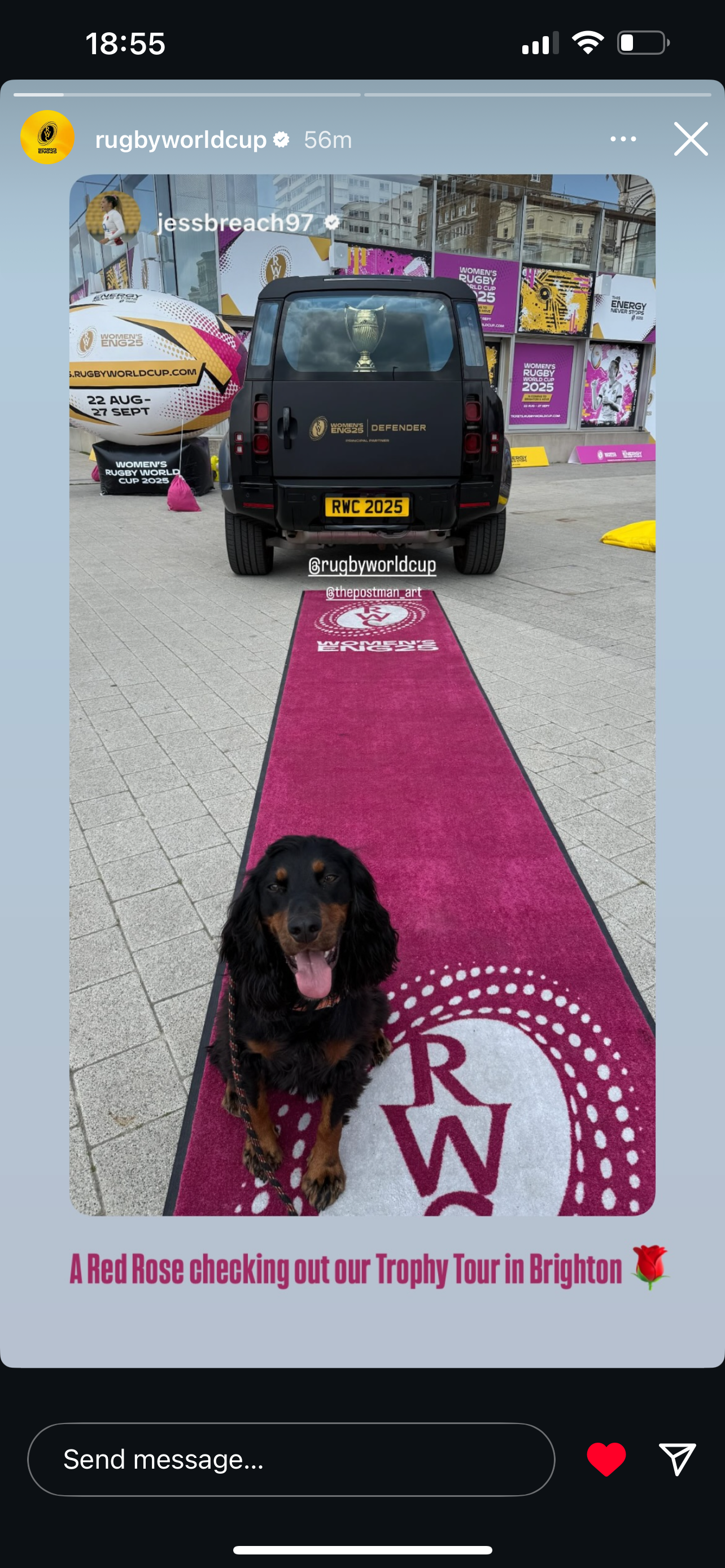
To mark 100 days to go until the Women’s Rugby World Cup 2025, this activation space was installed on Brighton seafront to celebrate the countdown and build excitement for the tournament.
I was responsible for designing the branded window panels, bench toppers, and supporting graphics. The goal was to create a bold, welcoming environment that captured the energy of the campaign and encouraged people to spend time in the space. My layouts used the official colour palette, type system, and messaging, applied across modular surfaces and seating to keep the visual identity consistent throughout.
The featured player portraits and street art-style panels were created by The Postman, whose expressive work added character and vibrancy to the site. I worked alongside their designs to ensure the surrounding graphics tied in seamlessly and supported the overall feel of the installation.
The result is a striking public space that celebrates the tournament’s approach, brings the brand to life, and creates a strong visual presence in a busy, high-footfall location.
Giant Inflatable Rugby Ball
As part of the promotional activation for the Women’s Rugby World Cup 2025, I designed this large-scale inflatable rugby ball to appear at Brighton’s i360. The goal was to create a bold, unmistakable presence that would both raise awareness of the tournament and drive ticket sales.
The design needed to be instantly recognisable from a distance, work at an unconventional scale, and hold up visually in unpredictable outdoor environments. I incorporated key brand elements, like the official tournament colour palette, logo, and slogan (The Energy Never Stops), while ensuring the typography and layout remained legible and balanced when applied to a 3D curved surface.
The ball features clear directional messaging (including dates and ticket URL). The layout was planned across all visible sides, considering how people would interact with it in public spaces and on social media.
This installation was featured on Brighton’s seafront near the i360 and is one of several activations building momentum toward the 2025 tournament.

Vinyl Floor Stickers inside Brighton’s i360
As part of the 100-days-to-go campaign for the Women’s Rugby World Cup 2025, I designed a series of rugby ball–shaped vinyl floor stickers installed inside Brighton’s i360 viewing pod.
The goal was to create subtle but effective brand touchpoints in an unexpected setting. Each sticker used the official tournament colour palette, typography, and logo, and was shaped like a rugby ball to tie directly into the campaign’s core visual theme. Placed along the floor of the glass pod, the stickers offered a playful way to reinforce key messaging as visitors moved through the space.
The designs were intentionally simple and bold to stay legible despite reflections, foot traffic, and the pod’s curved layout. Their shape made them instantly recognisable while still feeling integrated within the wider activation.
These floor graphics helped connect the interior of the i360 to the larger campaign presence on the seafront below, adding a layer of branding that was both functional and visually distinctive.

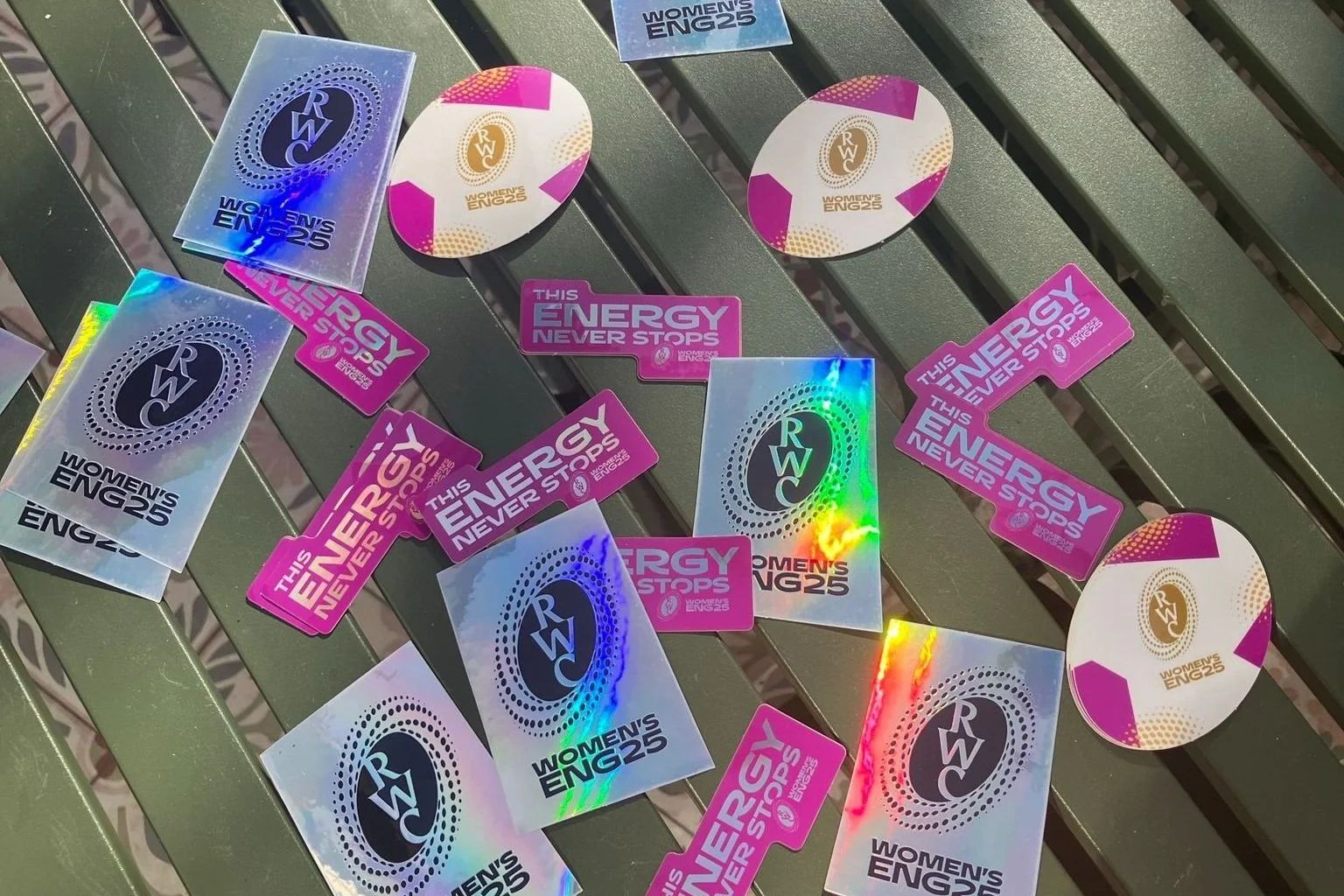
Promotional Sticker Set
As part of the promotional campaign for the Women’s Rugby World Cup 2025, I designed a series of stickers to be used across events, giveaways, and street-level activations.
The set includes three designs: the tournament logo, the official campaign slogan (This Energy Never Stops), and a stylised rugby ball featuring the Women’s ENG 2025 branding. Each was created to be instantly recognisable, bold in colour, and visually consistent with the wider campaign identity.
Some of the stickers were produced with a holographic finish to create added visual impact and make them stand out in natural light or on surfaces like water bottles, laptops, or notebooks. The rugby ball-shaped stickers tied directly to the sport, while the slogan and logo pieces served as strong, standalone brand marks.
These stickers were designed not just as promotional items, but as shareable, collectible pieces that helped extend the tournament’s presence beyond official venues. Whether handed out at activations or picked up at local events, they became a low-cost, high-impact way to build familiarity and excitement around the Women’s Rugby World Cup.
Match Schedule Design
This piece started as a newspaper ad, designed to share the full tournament match schedule in a clear, engaging format. I created a layout that organised all four pools and the knockout stages, using bold colour-coding, national flags, and clean typography to help readers easily follow the structure of the competition.
After the initial design, the project evolved into something bigger. The schedule was repurposed as a standalone collectible wall chart, a memento that people could pick up from various locations across host cities. This meant redesigning the print as a double-sided poster, where one side featured the full schedule and the reverse served as a branded cover design, carrying the tournament identity.
I handled both sides of the design, making sure it worked whether it was hung up as a poster or folded as a handout. The result was a piece that was not only functional but also something fans could keep as a lasting reminder of the tournament.
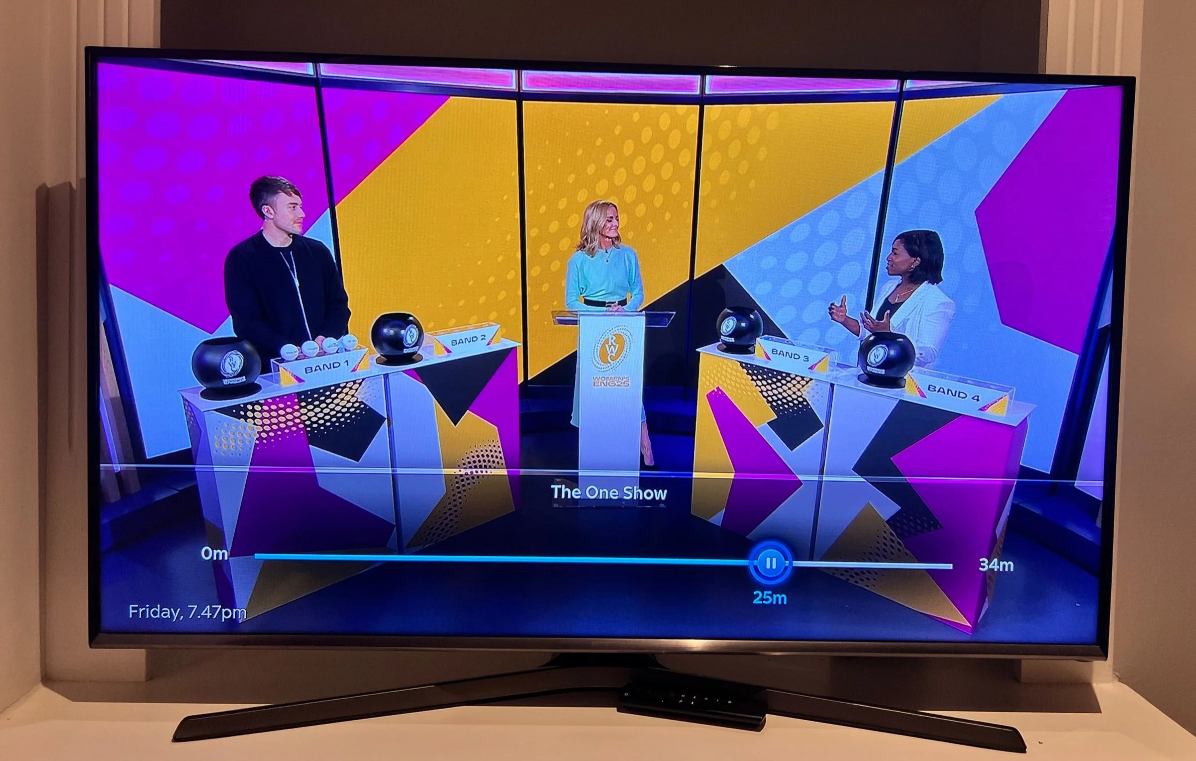
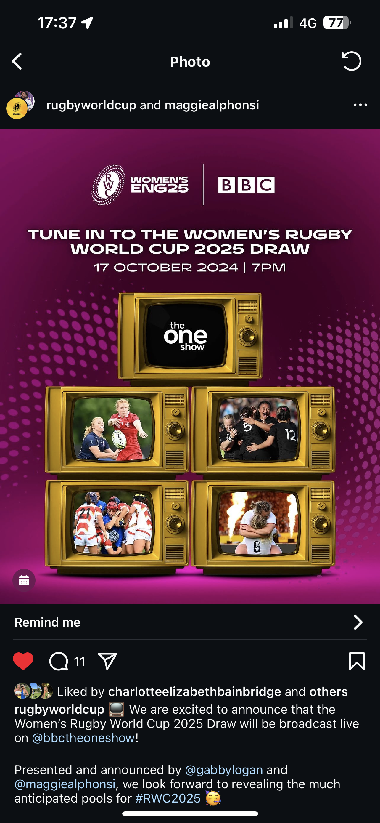
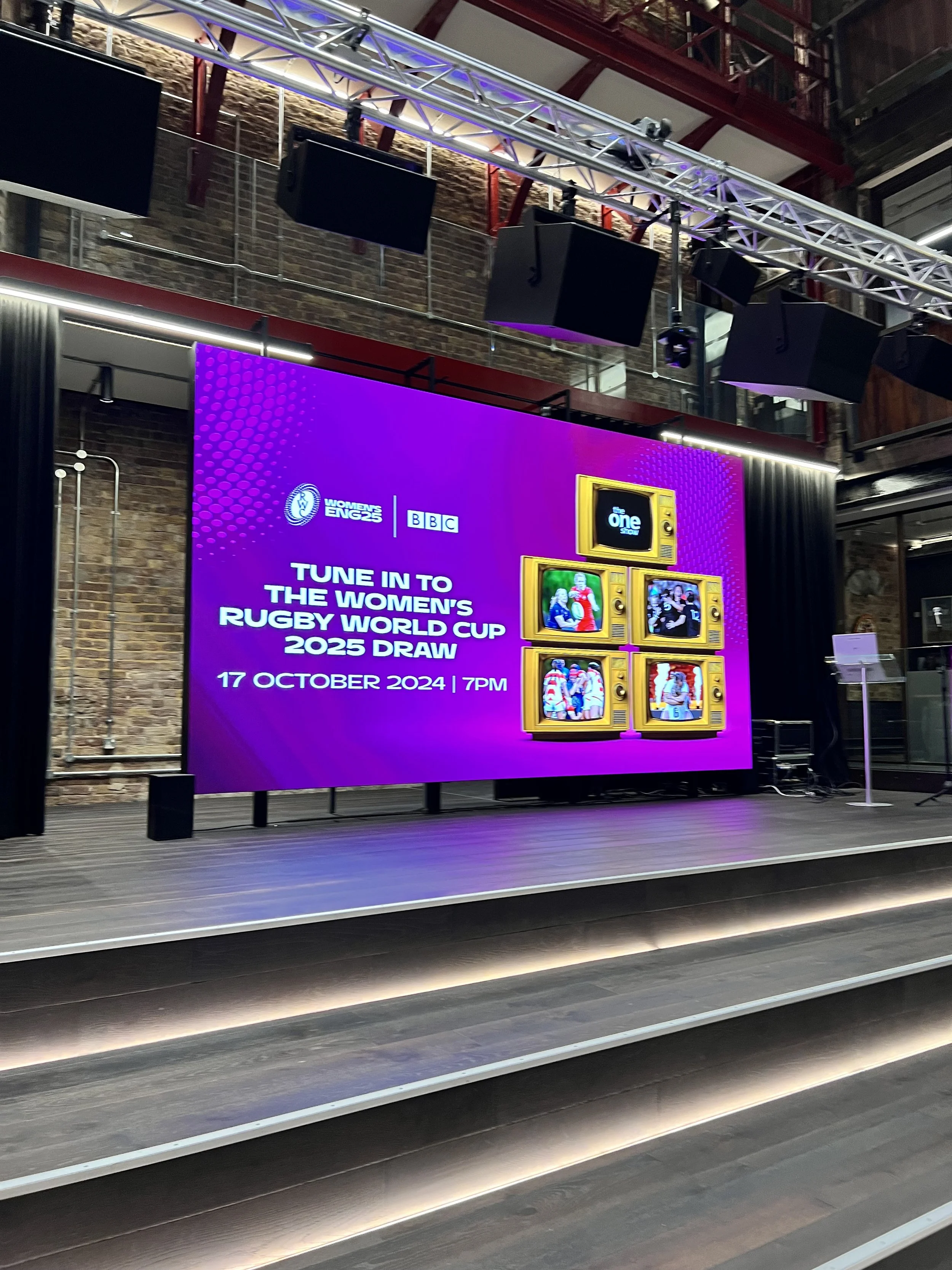
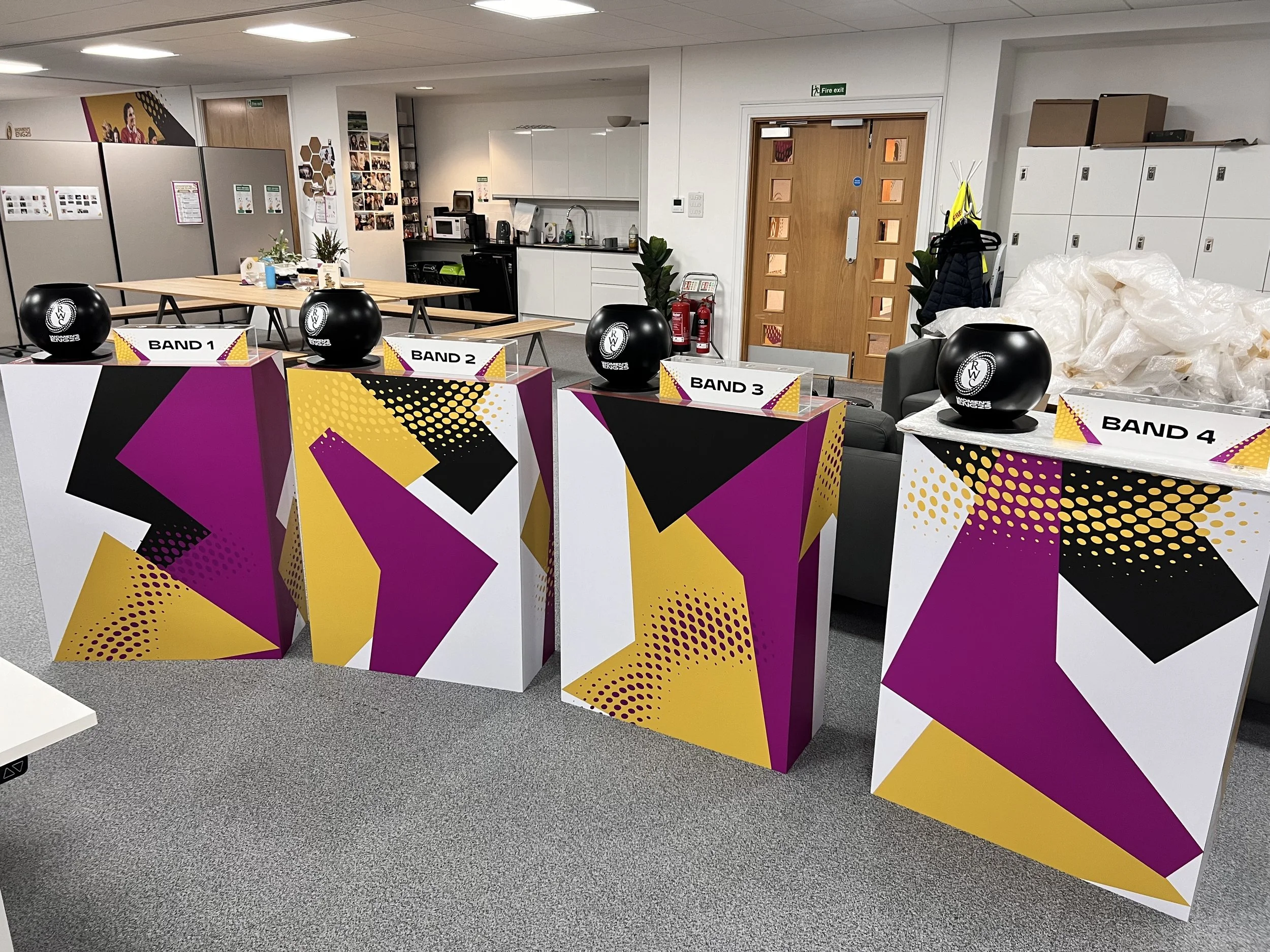
Official Draw Set Design for BBC One Show
I was responsible for designing the visual environment for the official tournament draw, broadcast live on BBC’s The One Show. The goal was to bring the tournament’s bold, energetic brand identity into a broadcast setting in a way that felt dynamic, polished, and on-brand for both the BBC and the Women’s Rugby World Cup.
I created custom graphics for the four draw tables (Bands 1–4). The design used strong geometric shapes, contrasting angles, and the core brand palette of hibiscus, gold, white, and black, supported by subtle halftone textures and layered patterns. Everything was tailored to look great on camera, vibrant without being distracting, and structured to frame presenters cleanly in wide and close-up shots.
I worked closely with production to ensure the designs translated well to physical builds and lighting conditions, and delivered all artwork ready for print and installation.
This was a high-visibility piece and a key moment in the lead-up to the tournament. It was exciting to see the brand come to life on national TV in a live format.
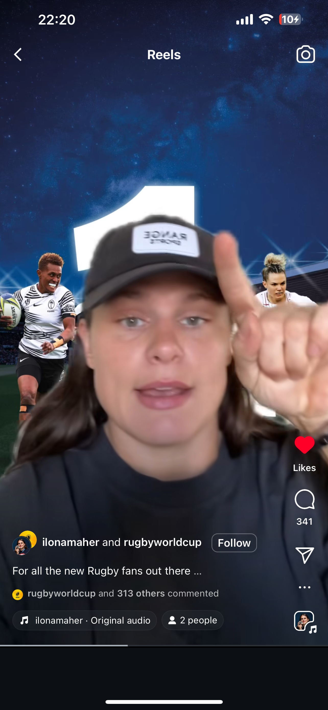
One Year To Go, The Hero Graphic
To mark one year until kick-off, I designed the official campaign hero graphic for the Women's Rugby World Cup 2025. This high-impact visual featured top international players in action and was created for use across digital, social media, press, and stadium screens.
I handled the full creative process, from compositing and retouching each player, to building out the stadium backdrop, lighting effects, and type treatment. The aim was to capture the energy of the tournament and spotlight the athletes front and center.
The graphic was widely shared by World Rugby across platforms and even picked up organically by players. U.S. player Ilona Maher featured it in her Instagram Story and used it as a background in one of her Reels, a nice full-circle moment showing the work connecting with fans and athletes alike.

Office Branding at Webb Ellis House in Twickenham
The aim for the Women’s Rugby World Cup office branding was to bring energy, pride, and identity into the workspace. The designs reflect the bold visual language of the tournament, using strong colours, geometric shapes, and impactful photography.
Large-scale wall graphics feature action shots of players, combined with sharp diagonal layouts and accent patterns in gold, hibiscus, and black. The "Qualified Teams" wall includes national flags to highlight the global nature of the event, with space left for future additions as more teams qualify. These visuals not only serve an informative purpose but also create a sense of momentum and anticipation.
Vertical panels throughout the office highlight the brand’s key messaging pillars: Bold, Celebrate, and Champion. Each word is paired with powerful imagery that brings the value to life, helping to anchor the workspace in the tone and spirit of the tournament. These pieces break up the white space and help define different areas, making the environment feel dynamic and purposeful.
Overall, the space connects directly to the energy of the Women’s Rugby World Cup, turning a functional office into a branded hub that reflects the drive and focus of the team behind the scenes.